Choosing lingerie colour for the clothes you actually wear
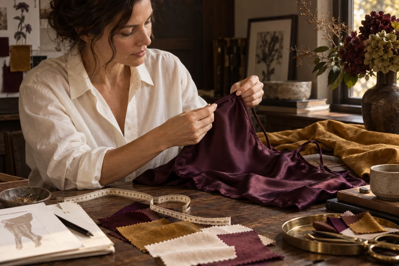
The drawer is full of sensible shades. Then you pull out the shirt you wear twice a week, and the piece that looked discreet on a product page suddenly becomes the most noticeable part of the outfit. Colour works in context. The useful question is not “What colour should lingerie be?” but “What do I want this particular piece to do under the clothes I own?”
Sometimes you want it to recede. Sometimes you want a bralette edge or a colour to show. Both are deliberate choices. Neither requires a universal chart of “flattering” shades or a rule about what your body ought to wear. Start with one outfit, one purpose, and the light in which you will actually see it.
Start with the garment above it
Take a shirt, dress, or pair of trousers you already wear. Hold it up to light or try it on over the lingerie you own. Does the fabric show the colour beneath, the shape of a seam, or both? A white shirt can be opaque in one weave and nearly transparent in another. A dark dress can still reveal an edge if the fabric clings. The garment above determines much of what will be visible.
Notice the distance between the layers. A loose blouse behaves differently from a fine, close-fitting top. If a piece will sit under work clothes for hours, the way its straps and seams move may matter more than its colour. If it will be visible through a sheer layer, the colour may become part of the outfit rather than something to conceal.
Keep the example specific. “Under my cream linen shirt” gives you a better test than “under light clothes.” You can then ask whether you want a close match to your skin, a deliberate contrast, or another layer between the shirt and the lingerie. The answer belongs to that outfit.
Decide whether you want to hide or reveal
“Discreet” can mean several things. You may want a colour that blends with your skin beneath a thin fabric. You may want matching fabric that looks intentional when an edge appears. Or you may be perfectly happy with a visible line so long as the garment feels comfortable. Naming your preference helps you avoid buying a colour because a retailer calls it essential.
If invisibility is your aim, test contrast rather than assuming white disappears under white. The relevant contrast is between the lingerie, your skin, and the outer fabric together. A shade marketed as “nude” is not a universal reference: skin tones vary, and so do fabric opacity and lighting. You might need a warmer, cooler, darker, or lighter shade than a product's label suggests. That is a visual judgment, not a fixed formula.
If you want to reveal a colour, ask how much of it will show. A narrow strap at a neckline, a bralette under an open shirt, and a sheer blouse create three different compositions. The colour need not dominate; it can be a small accent. It can also be the point of the outfit. There is no requirement to keep the choice subtle.
Fit and seams can be louder than colour
Sometimes the shade is fine, but a band cuts into fabric or a seam creates a line. Swapping beige for another beige will not change that construction. Look at the edge finishing, cups, straps and band before treating colour as the whole problem. If the garment above catches on lace texture or raised stitching, a smoother surface may matter more than any colour change.
Check the fit in motion. Sit, reach, and walk in the outfit. A strap that stays hidden while you stand still may appear when you move. A band can shift under a knit top, changing where a line falls. These are observations you can make with the pieces you already own; a product photograph cannot settle them for you.
Our guide to measuring for a bra helps when the band or cup feels wrong. The measurement is a starting point, and the construction still matters. A colour choice should not become a way to ignore a fit that keeps drawing your attention throughout the day.
Take photographs carefully, then trust the room
A phone photo can help you compare two options, especially if you take both in the same place and light. It can also mislead. Exposure, automatic colour correction and a bright screen may make an edge disappear in the image even when you see it in person. Use photographs as another view, not as proof.
Stand near a window and then look under the lighting where you will wear the outfit. Soft daylight, a brightly lit office and a dim restaurant can make fabric and colour appear different. You do not need to test every possible environment. Two realistic checks are enough to learn whether your choice matches your intention.
If you are buying online, look for more than a single studio image. A picture against a plain background helps you see the item; an image on a person may show how the colour sits against one skin tone. Neither predicts your own outfit. If the retailer lists several colour names with nearly identical thumbnails, ask for a clearer image or compare a physical swatch where available.
Build from what you actually repeat
Before adding a new colour to your drawer, notice the clothes that return every week. A pale work shirt, dark dresses, a favourite knitted top: those pieces offer a more honest starting point than an imagined collection of outfits. One lingerie colour that works with two frequently worn garments may be more useful than a “versatile” shade you never reach for.
You can also decide that a colour has a single job. Perhaps a deep plum bralette looks right under one loose blouse. That is enough. It does not have to coordinate with the whole wardrobe to deserve a place. The issue is whether you like wearing it and know when you would choose it.
Be wary of treating a new colour as a fix for an uncomfortable piece. You might first prefer a different cut, fabric or size. Our fabric guide separates fibre names from fabric structures so you can ask better questions about feel and coverage. Colour is one part of the choice, not a replacement for the others.
Read the care information before falling for a shade
Dark, saturated or delicate colours may need care that fits your routine. Read the finished garment's label, including any instruction to wash separately. The US Federal Trade Commission's care-label guidance gives colour transfer as one reason a label may say “wash with like colours” or “wash separately.” That US rule is an example of why the instruction matters; the label on the garment you choose is the practical reference.
If you cannot tell how a piece should be washed from the listing, ask before buying. A colour you love can become a piece you avoid if its care routine is difficult to manage. Our guide to washing and storing lingerie turns label instructions into ordinary steps without pretending all fabrics need the same treatment.
Care symbols have categories for washing, bleaching, drying, ironing and professional treatment; GINETEX publishes a reference chart. You do not need to memorise them. You need to find the instruction attached to the actual garment and decide whether it works for you.
A useful way to choose between two colours
If you are comparing two shades, lay out the outer garment and describe what each option changes. Does one blend into the skin more closely? Does the other echo a visible part of the outfit? Are you choosing the colour because you enjoy it, or because a guide insists it is mandatory? Put fit, care and availability in the same comparison. A shade cannot compensate for information the seller does not provide.
Then leave the decision alone for a moment. Try the outfit again if you can, or ask for a better picture of the two options. There is nothing wrong with choosing the colour that simply makes you want to wear the piece. The point is to make that choice with your own clothes in mind, rather than taking a generic rule home with you.